
Wednesday, November 28, 2012
Tuesday, November 20, 2012
The Poster Project Reflective Essay
The Assignment that i was asked to do was combine the 4 symbol elements , My Identity Poem , and the key words , into one project . I learned that you can do a different project and combine it all together and murge it into one whole thing . I used the align tool and i copied and pasted what i needed to do and placed it all on different layers to organize it . The steps used to complete this project is :
1. I already had my poem on one document so i just locked the layer
2. I copied and pasted my 4 - identity symbols placed it to the side and also locked that layer
3. I copied and pasted my 4 key words and locked that layer as well
4. Then i found the words in my poem that matched my key words and i replaced it and shrunk the size to make it fit better .
5. I then made a border around the page using two of my 4 identity symbols , i used the zebra and the lawnmower and i incorporated the colors of the grassy theme with it .
6. Then i used the face and placed in the middle of my poem and changed the colors to match the blue and green
7. I saved my project and my project was complete .
I think this poster is a success because it wasn't hard at all , maybe at first but its only because i didn't understand it . But overall it was easy and i finished and i think it turned out very nice . The work elements that worked well would have to be the 4 identity symbols . It was the easiest to come up with an idea for and its a nice layout . i wouldn't have designed anything differently and I'm not just saying that because i feel that would make more work for me I'm saying that because it fit with my perfect perfectly . i think adding them all together it made each individual element a lot nicer and it gave it a purpose to really pop !.
I really liked this assignment , we got more time and i took my time and used it wisely and i had fun doing it . i learned that with graphic design you really can do almost anything and its just amazing how much you can learn and do using graphic design . And the tools used really helps even more . i learned that with this software you can have a ton of fun and complete a 45 minute project and make it look like a months worth of work its simply that amazing . it was easy and i overcame no problems at all because i honestly didn't face any .
I can connect this with my chemistry class . i say this because its like designing a chemistry poster and adding all these individual things and making it into one big thing . As far as the real world you it can be used if you have a job and your asked to create a poster design . The project that i completed can help me in many ways and i learned a lot from it and will use it later in life
Thursday, October 25, 2012
Alphabet Reflective Essay
For this project i was asked to complete a chart of alphabets , using the letters " o " and " i " . using these letters i was able to complete the entire alphabet . i learned that each letter is made up out of o and i and that i did not know before . for this project i used adobe illustrator and i used pathfinder to arrange the o and i to make the other letters . i also used the selection tool to move it around and place it where i want to . the steps i used to do this was :
1. first i made an o and i to the size and length i wanted it to be

1. first i made an o and i to the size and length i wanted it to be
2. i played around with the letters and started making easy simple letters like an a , or a b .
3.i continued this process until i had full rows of alphabets
4. i added the swatch of my 4 symbol project and placed it in my letters
5.i arranged my letters so that its even and looks nice
my artwork looks a lot like my 4 symbol project , it contains the same colors . and i think its extremely creative it looks really green and earthy like a global warming theme or a nice day outside but in the form of letters .
I created this project using the same theme from my four symbol project and i i created all the letters and made it into my own thing . i combined the concept because i added green at the top and bottom and the middle contained both blue and green . a challenge i had in this project was making one letter , the " s " it was hard to combine the c and make it into a perfect s , as you can see it still isn't that perfect but its good enough . my alphabet matches my identity precisely .
I felt really good about the assignment . i learned from it and it was fun and simple and a good way to express your creativity . i learned how to make letters of the entire alphabet out of o and i . i learned that this software can be used for many different things . and it is very useful and has many things to make whatever your doing pop , and stand out . i learned that if i really try and put my mind to something i can do it because when i first saw the project i assumed it would be hard until i found ways to make it easier and fun for me . this project was easy and a little hard but i did it and finished it no problem . i overcame my problems by asking for help which i should do more often and it became easier and i understood it more .
I can use something like this to teach another student not nessassarily for myself because the only time i can do something like this is in graphic design but i can help another student . and for the real world this can be used if i want to major in graphic design . and i would feel extremely proud of myself if i am able to do that .
I can use something like this to teach another student not nessassarily for myself because the only time i can do something like this is in graphic design but i can help another student . and for the real world this can be used if i want to major in graphic design . and i would feel extremely proud of myself if i am able to do that .
Tuesday, October 9, 2012
4 Identity Symbols Reflective Essay
For This project we were to create a 4 identity symbol using 4 elements such as plant , tool , animal , and human . I learned that one thing can be used in many different ways and can be made up of many different things . I learned how to use the clipping mask tool and the swatches tool to make my zebra and combine things such as grass and a lawnmower and a human using that specific object . I used the computer , google , adobe illustrator CS5.1 , and the paper given with the following instructions to do the project . The steps i used to complete this assignment was :
1. I got an idea ,
2. I put that idea on paper which was a zebra , which became my first element ( animal ) .
3. I dragged a photo in adobe illustrator and i dimmed the photo and locked it then i added a new layer with the photo in it and i used the pen tool to outline the figure of the zebra
i locked that layer and got the idea to use a swatch to combine grass and a sky into my zebra figure
5. I then got a lawnmower and traced that figure like i did in step 3 . and i added the main colors im using in this project which is green , white , and gray .
6. I locked that layer and moved onto my next one which was my last element being i already used 3 .
7. I got an image of a human face and outlined it and added those same colors .
8. I locked all layers and my project was complete .
My artwork looks like a going green campain , it expresses the elements that have to do with a zebra and its enviroment . zebras eat grass thats what thats for and grass is cut by lawnmowers which is why thats there and humans use lawnmowers to cut grass . each element i have has to do with one another .
A symbol is something that represents an idea, a process, or a physical entity. i came up with the idea that i did based off of i personally like zebras they aren't dangerous animals and they're source of food is grass they aren't like tigers who go around eating other animals and praying they eat on grass which is pure in my opinion . i came up with each 4 symbols like i said because each symbol has to do with the other and it makes the entire project come together . This zebra and this entire project repesents me because i'm pure and i have a specific love for earth and the color green and what it repesents .
i felt that this assignment was a good one it gave us students a chance to learn new things and used what we know to complete something . this project helps us put things together and organize and plan out things and show how one thing can be many or in this case a 4 symbol identity project . i learn that in graphic design its not about just using tools in the specific document you have to use your mind and imagination , you have to put things together in your mind before you can get it out on paper , you have to search deep within yourself and find that hidden part in you an d get an idea from it . this project showed me i can do that that i can be creative and combine all these things and make it meaningful and make it make sense . it wasn't easy but i did it so that shows me its was extremely hard and i could do it if i work hard and put my mind to it . i overcame them by thinking positive and not so much bout time and what others would think about it what mattered was what i thought about it how i felt about it .if i could improve two things it would be a little more creativity and thought now that i know i can do better and i would use my time more wisely .
This project will help me in other classes such as photography and fashion after school , i can use my creativity skills and it also will help me with future projects i have to do now ill know what to do and which tool does what and ill know how to make my project pop . and stand out . this project really motivated me to want to do more with other projects and in life .
Friday, September 21, 2012
Identity Poem
Emani Is My Name .
I’m Weird , Honest , Strong , and Independant .
Fierce like a lion , cute and cuddly like a penguin
i love my baby brother , like the son i never birthed
my little sister and i have our moments but i love her
my brother well thats another story
vogue , seventeen , E news , and food magazines are the best kind of things to read
as for the fashionable magazines its good because you see who lost it & who still got it
i like basketball ; lakers are the best whopp whopp . gold and purple never looked better toget
her
the most amazing color in the world ? BLUE because its so many shades too it and its just awesome
i love to text it keeps me from being bored and shows people want to talk to me
Snowy days are cool not the coldness but the scenery of it all
To see people walking enjoying themselves , kids running around expieriencing outside and just so full of life brings joy to me
i wish this world was a better place , people would be kind and not try to kill one another every second
i need hope faith and freedom in my life , everyone who doesn’t have it does
i aspire the finer things in life , enough said .
prioleau
My Vocabulary
Abstract - thought of apart from concrete realities, specific objects, or actual instances .
Back Ground - the ground or parts, as of a scene, situated in the rear .
Complementary Colors - one of a pair of primary or secondary colors opposed to the other member of the pair on a schematic chart or scale (color wheel), as green opposed to red, orange opposed to blue, or violet opposed to yellow.
contour -the outline of a figure or body; the edge or line that defines or bounds a shape or object .
creativity - the ability to transcend traditional ideas, rules, patterns, relationships, or the like, and to create meaningful new ideas, forms, methods, interpretations, etc.; originality, progressiveness, or imagination .
Expression - the act of expressing or setting forth in words .
imagination - the faculty of imagining or of forming mental images or concepts of what is not actually present to the senses.
observation - an act or instance of noticing or perceiving.
portrait - a likeness of a person, especially of the face, as a painting, drawing, or photograph.
secondary colors - a color, as orange, green, or violet, produced by mixing two primary colors.
skethbook - a collection of essays and stories.
texture - the visual and especially tactile quality of a surface .
value - relative worth, merit, or importance .
Friday, September 14, 2012
pictures
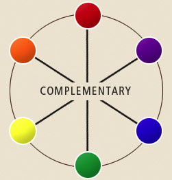 |
complementary colorsComplementary Colors : one of a pair of primary colors opposed to blue or violet opposed to yellow . |


Tuesday, September 11, 2012
Why Blog ?
1. I was asked to make a blog for graphic design because making a blog
in a way can show others what your like , and who you are without really
saying it in words . People can learn a lot about you which is Good .
2. Designing and writing a blog can help you career and
future wise because if your into art having an artistic blog shows
mostly what you love and want to do . and colleges will look at that and
see that you enjoy what you do and that your talented and know what you
want in life . say if you like photography having that type of blog
shows exactly what kind of things you love taking pictures of or what
your interested in .
3.Blogs are used by creating a title that makes up
what your blog is and having things on there that describe you , what
you love , and what you want to do .
4. If
people enjoy whats on your blog and find comfort like benefit from what
your blog brings more and more people will see and word gets around and
if its extremely good someone important can see and also see what you do
which will be good , because you can possibly go far with that .
5. A blogger can earn money from their efforts
because if you blog things that other people are interested in your blog
becomes popular and more and more people see it and if someone wants
you to make a blog for them or promote something you can actually get
money .
Subscribe to:
Posts (Atom)